Tis the Season Australasian Blog Hop
 Welcome to the CTMH Australasian ‘Tis the Season Blog Hop. This hop features the artwork of some talented women from across Australia and New Zealand.
If you arrived from Doris' blog you are in the right place. If this is your first time on a blog hop simply read on, enjoy my creations and maybe share your response in the comments. Then you click on the link at the end of this post and it will take you to the next blog and so on and so on. Easy and fun! Best part- you can see lots of different projects you can create with Close To My Heart’s 'Tis the Season collection! When you land back here, you are done and it’s time to hit the scrapbook room for some crafting fun.
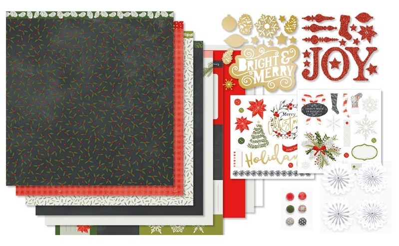
 The ‘Tis the Season collection is available until the end of December 2018. Buy it as a full kit or purchase individual items.I have loved using this paper pack for my Christmas photos of last year but today’s layout has nothing to do with Christmas.
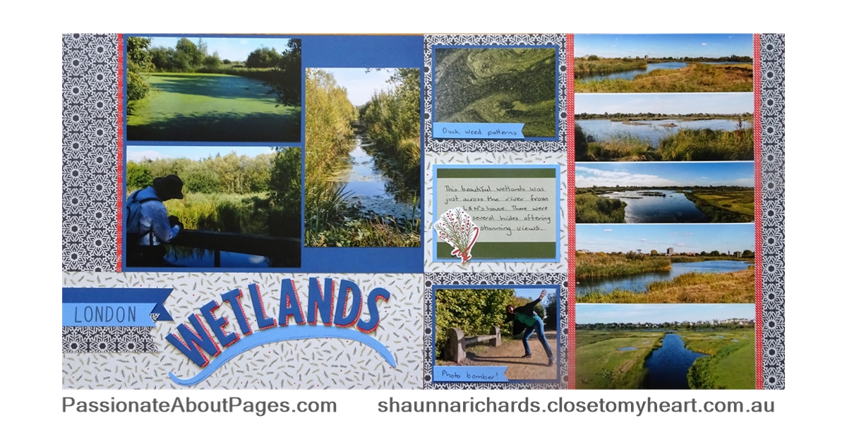
I’ve used 2 packs of this paper. I pulled out my left overs to see what I could use on this hop. I had lots of the paper with Charcoal on one side and Candy Apple on the other and a bit of the fern leaves print. Mmm, what to do??? I called on my new best friend!

The Love of Colour Book is an invaluable resource we all need to own. It shows colour combinations that work together! I flipped to the Charcoal page and saw that Charcoal, Candy Apple, Fern, Sapphire and Carolina were suggested as a good combo. Brilliant! 3 of those colours were already in the papers I had selected. All I had to add was the two blues.

This layout is based on the Now You See It layout in the Magic How To book (p22). It worked perfectly for the panorama shots we had taken. I had printed them on 4x6 paper so they were all the same width but different heights. It was easy to fit several in a line on the right hand side of the layout.

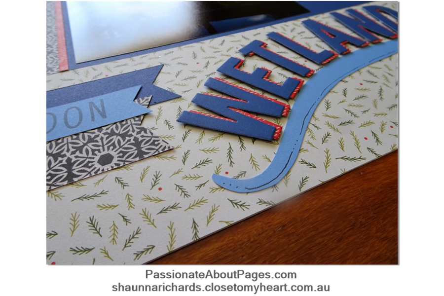
I loved the title design in the ideas book and re-created it with Block Alphabet Thin Cuts and a free hand drawn and cut flourish. At first I just had Sapphire letters but when I added the Candy Apple print behind them, they really popped – especially when I used foam dots!!
The moral of this story is to look past the obvious theme of a set of papers and discover how adaptable they can be.
The ‘Tis the Season collection is available to purchase from your Close To My Heart consultant. A list of products used in my projects appears at the end of this post. Place your order with your Close To My Heart Consultant. If you don’t have a consultant, you can order online through my website .
I’d love you to leave a comment for me before you go. Then click on the underlined link and move on to Vandra’s Virtual CTMH Craftroom to see the project she has designed for you. I’m sure it will love it ‘cos she is so talented!
Happy Scrapping, Shaunna
Close To My Heart products used in this projects X7239B Tis the Season paper Pack 9045 Love of Colour Book Z3386 Block Alphabet Thin Cuts X6021 Sapphire Cardstock (light side) X5990 Carolina Cardstock Z2831 Charcoal Ink Z1979 LePen Journaling Pen
Categories
- Cards (64)
- Stamping (109)
- Thin Cuts (49)
- Photo Organisation (1)
- Album Planning (1)
- Scrapbook Layouts (244)
- Stamp of the Month (91)
- Paper Craft (11)
- Paper Fundamentals (17)
- Simple pages (2)
- Washi Tape (8)
- Flip Flaps (11)
- Tools (16)
- PML (4)
- Organisers (3)
- stickers (6)
- Albums (7)
- Workshops (3)
- watercolour pencils (2)
- Watercolour paints (2)
- Workshops Your Way (34)
- Special Offers (39)
- Organise Your Photos (3)
- Craft with Heart (3)
- Storytelling (6)
- VIP (3)
- Shimmer Brush (1)
- Glitter Paper (1)
- Paper Candy (2)
- Interactive Cards (1)
- Metallic Markers (1)
- Tell Your Story (2)
- Distress Oxides (2)
- Nearly Bare Pages (1)
- Wedding (2)
- Stencils (1)
- Free download (2)
- Organisation (1)
- Same but Different (1)

7 comments
Leave a comment