Co-ordinating pages for unrelated themes

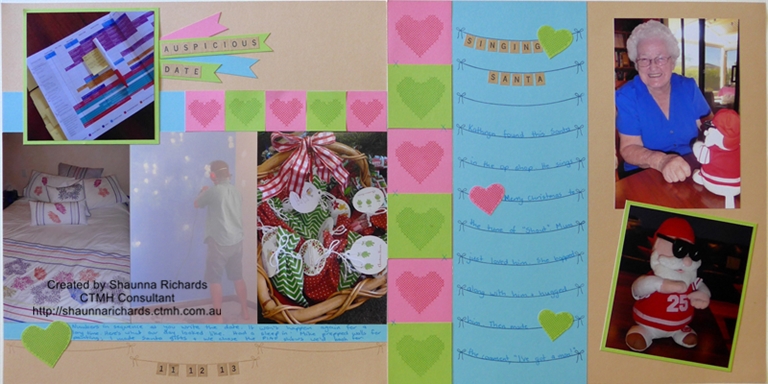
Sometimes we only have enough photos for a single page. "WOW!" I hear you say, "Does that actually happen?" The answer is , "Yes, occasionally." When it does it brings the problem of needing to find a way to co-ordinate the two layouts so it remains pleasing to the eye when you turn to this page in your album.
Here are my tips for this situation...

I decided plain cardstock was the go and just chose 3 bright colours I liked - I wouldn't be able to match colours to all the photos anyway. The colours reflect my mood more than the subject matter of the photos. I had just got my hands on this month's Stamp of the Month, Cross Stitch Wishes, so it was a done deal that they would provide the embellishments. A girl just has to play with her new toys!
I loved using the string stamp as my journaling lines and the little Keyboard Kraft Alphabet stickers ($6.50) are an absolute favourite for me at the moment. They just seem to fit with most layouts.
Get your Cross Stitch Wishes Stamp of the Month for just $5 with any $75 purchase during January or pay full price of $24 (S1401). Visit http://shaunnarichards.ctmh.com.au to order online or email me at shaunnarichards@bigpond.com
Here are my tips for this situation...
- Keep the layouts simple
- Use the same papers on both pages
- Choose generic images or shapes for your decorations
- Keep headings in the same style

I decided plain cardstock was the go and just chose 3 bright colours I liked - I wouldn't be able to match colours to all the photos anyway. The colours reflect my mood more than the subject matter of the photos. I had just got my hands on this month's Stamp of the Month, Cross Stitch Wishes, so it was a done deal that they would provide the embellishments. A girl just has to play with her new toys!
I loved using the string stamp as my journaling lines and the little Keyboard Kraft Alphabet stickers ($6.50) are an absolute favourite for me at the moment. They just seem to fit with most layouts.
Get your Cross Stitch Wishes Stamp of the Month for just $5 with any $75 purchase during January or pay full price of $24 (S1401). Visit http://shaunnarichards.ctmh.com.au to order online or email me at shaunnarichards@bigpond.com
Categories
- Album Planning (1)
- Albums (6)
- Cards (60)
- Craft with Heart (3)
- Flip Flaps (11)
- Organise Your Photos (3)
- Organisers (3)
- Paper Craft (11)
- Paper Fundamentals (17)
- Photo Organisation (1)
- PML (4)
- Scrapbook Layouts (235)
- Simple pages (2)
- Special Offers (38)
- Stamping (105)
- Stamp of the Month (90)
- stickers (6)
- Storytelling (6)
- Thin Cuts (49)
- Tools (16)
- VIP (2)
- Washi Tape (8)
- Watercolour paints (2)
- watercolour pencils (2)
- Workshops (3)
- Workshops Your Way (34)
- Shimmer Brush (1)
- Glitter Paper (1)
- Paper Candy (2)
- Interactive Cards (1)
- Metallic Markers (1)
- Tell Your Story (2)
- Distress Oxides (2)
- Nearly Bare Pages (1)
- Wedding (1)
- Stencils (1)
- Free download (1)
- Organisation (1)
- Same but Different (1)

0 comments
Leave a comment